Monday, 13 February 2017
Friday, 10 February 2017
Evaluation 2: How effective is the combination of your main product and ancillary texts?
Below is a power point presentation on Evaluation Question 2.
Wednesday, 8 February 2017
Evaluation 1 : In what ways does your media product use, develop or challenge forms and conventions of real media products?
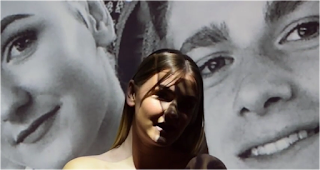
Once finishing our product we decided to upload our music video onto YouTube, this is because it is one of the biggest way people consume music. People can access YouTube from all sorts of technology such as computers, tablets, phones and apple products. YouTube lets you share videos on other social media network sites like Twitter and Facebook, so if people begin to like our video they can share it through other sources of media which makes it a big platform for us. YouTube is also used by the audience we are targeting for our artist, this means we are more likely to be picked up as an independent artist because our audience use the website and app, this has seen to be successful as other artists have been found through the use of YouTube.

 We have stuck to the conventions of the indie pop genre by having a narrative in our music video. The video follows a simple love story, with the main role of the female singing and looking back on her superficial love that she has. This becomes more clear that she is looking back on her memories with her boyfriend because of the scenes where the projector is used. Ella is looking back on the times she was happy and sharing to the audience one of her dates that she went on with him, before creating a superficial love.
 Also, the majority of our location is in the woods or in scenic places like most indie pop genres. However, you could say that we have subverted this by not creating mystery from the locations because the scenic areas are in the daylight, but we have created a sense of mystery as most of the video is from her boyfriends perspective, and the audience does not meet him fully you can only see him through the pictures we have shown through the projector.
The video conforms to the conventions for the genre's mise-en-scene, you are able to tell the type of person Ella is portraying by the way she is dressed and the amount of make up she is wearing. The clothing she is wearing is causal yet edgy, it isn't what someone would
 generally wear all the time. Her bandot is Calvin Klein this suggests to the audience that she is wealthy as she is wearing branded clothing, she is also wearing a pair of Jordans. Her make up is very simple, suggesting that she doesn't care that much about looks and prefers the natural look instead of having to go to extremes to make herself up to be someone that she isn't. In some sense make up can hide who you really are, whereas we have decided to showcase what she has naturally.
 We used many close ups throughout the video especially when she was singing the song, this is so the audience can see her expression her face to link to what is happening in the song. We also used a variety of long shots so that the audience could tell where they were on their date as they went to many different locations in London. We also did quite a lot of hand held shots because the music video is from her boyfriends perspective so when the camera moves it is like his movements.
 In the editing process we used put a few of the shots on a slow motion effect this is to emphasise to the audience of how much of a good time she is having to make them, feel more emotion towards her because the song is about heartbreak. Also, we decided to speed up the part of the video with her looking around the room reflecting on her relationship with her boyfriend, this is to show the audience how time goes fast and her going through different emotions of feeling lost and alone because of her superficial love.
 When designing our artists magazine advertisement we stuck to some of the conventions that we researched. One of the things I noticed when analysing the adverts all of the things in common was that most were very plain and too the point. People would get bored of reading too much on a poster, they would rather know the key information. This is why we only put the album title, the artists name and her twitter and Instagram name to promote her social media. Also, in the adverts that I have researched the artists did not have their full body in the picture. In some ways we have subverted this in our advert because we have used long shots instead of mid shots. This allows our target audience to see that Ella does have a different sense of styling instead of the one outfit that is used throughout the whole video. The advert as a whole can be appealing to our target audience because the audience is of late teens to the early 20s, therefore they want it to be to the point and able to relate to the artist to make them want to go out and buy it, which I think we have done through the costume decision. The styling has become more current by Ella having her hair in space buns and a chocker.
 Most of the digipaks I researched in the indie genre were colourful and pleasing to the eye. However, the artist Lorde has her digipak in black and white so we decided to follow in her footsteps. Our single from the album 'Superficial Love' is all about being in a fake relationship and wanting more. This can be shown through the digipak by making the background wall black and white and keeping Ella in colour. This allows the audience to believe that everything around Ella is miserable and dark, while she is trying to stay positive because she remains in colour. However, she is wearing grey colour so she may not be as positive as she likes to think she is.
The reason for the pink writing on the album is to show the consistency of the symbol of love, to show that it is always present. The colour is seen on the magazine advert and in the music video by using pink flowers as a scenery background.
As a result of our music video, magazine advertisement and digipak I believe we have generally stuck to the conventions of Indie Pop, while also trying to challenge and subvert them, making our 3 products a success.
 We have stuck to the conventions of the indie pop genre by having a narrative in our music video. The video follows a simple love story, with the main role of the female singing and looking back on her superficial love that she has. This becomes more clear that she is looking back on her memories with her boyfriend because of the scenes where the projector is used. Ella is looking back on the times she was happy and sharing to the audience one of her dates that she went on with him, before creating a superficial love.
  Also, the majority of our location is in the woods or in scenic places like most indie pop genres. However, you could say that we have subverted this by not creating mystery from the locations because the scenic areas are in the daylight, but we have created a sense of mystery as most of the video is from her boyfriends perspective, and the audience does not meet him fully you can only see him through the pictures we have shown through the projector.
 The video conforms to the conventions for the genre's mise-en-scene, you are able to tell the type of person Ella is portraying by the way she is dressed and the amount of make up she is wearing. The clothing she is wearing is causal yet edgy, it isn't what someone would

 We used many close ups throughout the video especially when she was singing the song, this is so the audience can see her expression her face to link to what is happening in the song. We also used a variety of long shots so that the audience could tell where they were on their date as they went to many different locations in London. We also did quite a lot of hand held shots because the music video is from her boyfriends perspective so when the camera moves it is like his movements.
  In the editing process we used put a few of the shots on a slow motion effect this is to emphasise to the audience of how much of a good time she is having to make them, feel more emotion towards her because the song is about heartbreak. Also, we decided to speed up the part of the video with her looking around the room reflecting on her relationship with her boyfriend, this is to show the audience how time goes fast and her going through different emotions of feeling lost and alone because of her superficial love.
  When designing our artists magazine advertisement we stuck to some of the conventions that we researched. One of the things I noticed when analysing the adverts all of the things in common was that most were very plain and too the point. People would get bored of reading too much on a poster, they would rather know the key information. This is why we only put the album title, the artists name and her twitter and Instagram name to promote her social media. Also, in the adverts that I have researched the artists did not have their full body in the picture. In some ways we have subverted this in our advert because we have used long shots instead of mid shots. This allows our target audience to see that Ella does have a different sense of styling instead of the one outfit that is used throughout the whole video. The advert as a whole can be appealing to our target audience because the audience is of late teens to the early 20s, therefore they want it to be to the point and able to relate to the artist to make them want to go out and buy it, which I think we have done through the costume decision. The styling has become more current by Ella having her hair in space buns and a chocker.
 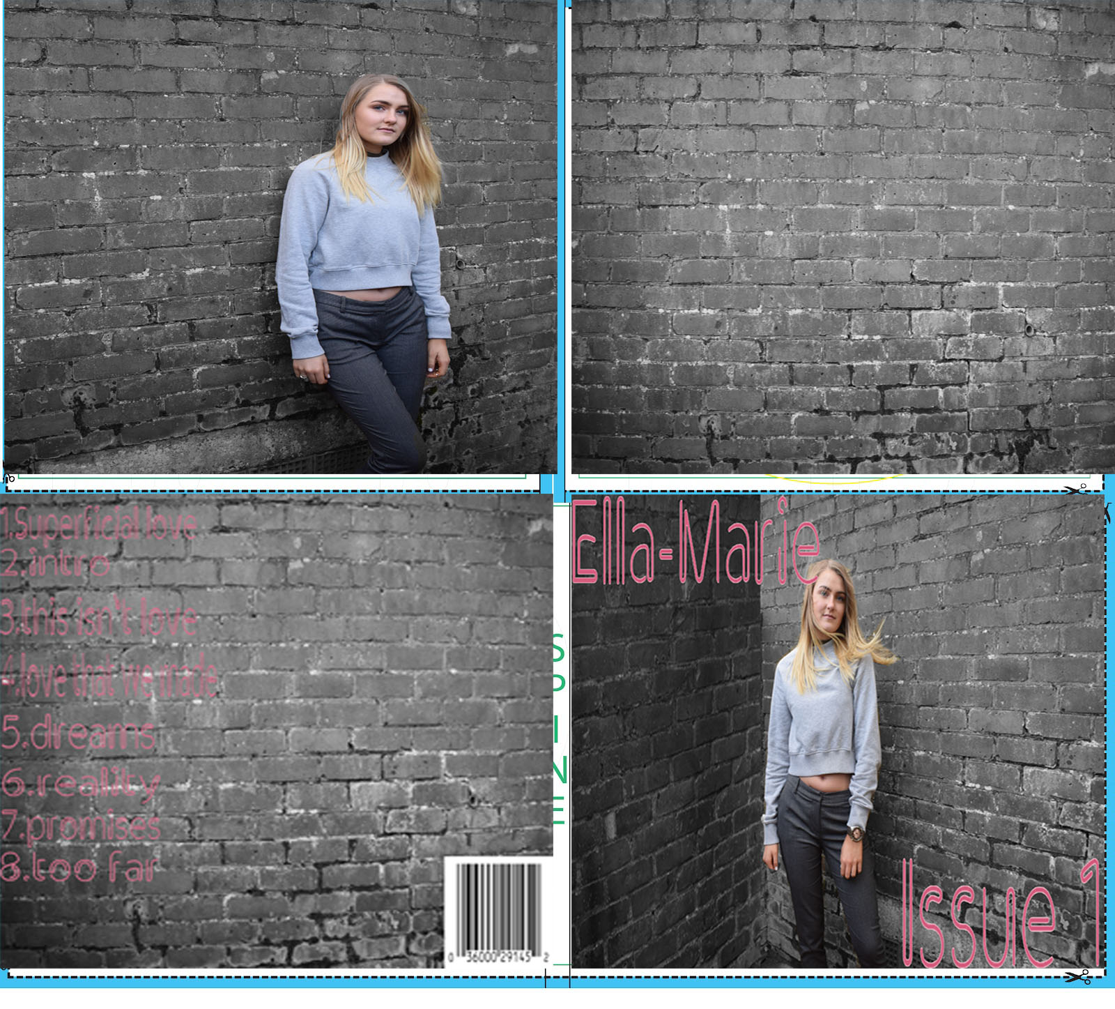 Most of the digipaks I researched in the indie genre were colourful and pleasing to the eye. However, the artist Lorde has her digipak in black and white so we decided to follow in her footsteps. Our single from the album 'Superficial Love' is all about being in a fake relationship and wanting more. This can be shown through the digipak by making the background wall black and white and keeping Ella in colour. This allows the audience to believe that everything around Ella is miserable and dark, while she is trying to stay positive because she remains in colour. However, she is wearing grey colour so she may not be as positive as she likes to think she is.
 The reason for the pink writing on the album is to show the consistency of the symbol of love, to show that it is always present. The colour is seen on the magazine advert and in the music video by using pink flowers as a scenery background.
As a result of our music video, magazine advertisement and digipak I believe we have generally stuck to the conventions of Indie Pop, while also trying to challenge and subvert them, making our 3 products a success.
Wednesday, 1 February 2017
Final Digipak


Tuesday, 24 January 2017
Draft Magazine Advertisement
This is a first draft of some ideas for a magazine advertisement for our artist, that I thought could work taking the research on similar artists into consideration.

This is my final idea of a possible outcome for my groups magazine advert. This is very plain and a simple idea, but the research I found is very similar to the one I have created below. They didn't have loads of vibrant writing all over the advert. They gave the important information and kept the colours very neutral. The reason for the colouring of the writing is so that it matches the colour of the top. The colour pink is a symbol for unconditional love and kindness, linking to the word love in the title. Some people would argue that the colours should not be pink as we are talking about a superficial, fake relationship. However, during the song she is singing about wanting to try and believe in love and the relationship. Again we decided to go for a natural look for make up so that in advertising she is reflecting who she is in the video and who she is as a person, very similar to Lorde's advertisement for her music.

Below is Catherine's draft magazine advert for our artist. This is a very basic and simple draft made but this allows the audience to focus more on the artist. By having the colour of the font in black it is still bold for the audience to see so it stands out but also because Ella is wearing the colour pink the focus is more on her rather than making the information on the advert stand out. The images we choose together before we decided our final so we could go for a similar look in both of our drafts.

Saturday, 21 January 2017
Research for Magazine Advertisement
After interviewing our female target audience of 18-25 year olds, their main magazines that they read are Vogue, Glamour, Cosmopolitan, Company and Elle. This is so they can get the latest updates on fashion, to get some good make up tips and read what some celebrities have been up too. Some music magazines that they have said that they read are Rolling Stones, Billboard and Q. Most of out target audience said that they are more likely to buy adverts which are appealing such as colouring and where fans can find a direct link from the poster to their music and what the artists image is about.
After researching different types of magazine for our genre we carried out a questionnaire of 5 questions asking our target audience what they would expect to find in a magazine Advert for music. We asked questions such as do you look out for make up and hair style in the Advert and what kind of colours do you expect. They came back and said they would prefer neutral colours and like natural make up to relate to the artist more because it fits in with the genre of music.
After researching different types of magazine for our genre we carried out a questionnaire of 5 questions asking our target audience what they would expect to find in a magazine Advert for music. We asked questions such as do you look out for make up and hair style in the Advert and what kind of colours do you expect. They came back and said they would prefer neutral colours and like natural make up to relate to the artist more because it fits in with the genre of music.
Friday, 20 January 2017
Draft Digipak
This is the first draft of ideas I have made for our digipak. 

 I then developed these ideas further and decided that instead of pink roses we should consider having red roses. The reason for this is because although pink represents love it is a very delicate colour. However, the colour red can symbolise danger as well as love. As one of the song and our music video song is called 'Superficial Love', this suggests that the girl is in danger and needs to be warned that not all Love can be real. The use of the falling petals is to represent that love is dying out and it doesn't always last as the rose begins to wilt. The reason for having black as the background colour is because it represents elegance as well as aggression towards love and it's death.
The front of the album cover is simple, it is not overcrowded and includes the artist on the front, with the title and Ella's name. The colour of her outfit represents dullness and emptiness they she feels when thinking about her love that she once had that she doesn't anymore. This let her fans make the link between her clothing and the title and even people who aren't fans but are part of the target audience will hopefully make the link.
Below if my idea for a completed digipak.

Thursday, 19 January 2017
Test Shots for Ancillary Texts
Before creating both our ancillary texts we took some pictures of our artist for both magazine and digipak. This allows us to have a range of pictures for us to choose from to pick the best possible picture that audience will like and that portrays our artist the best. We choose to have different clothing to show our artists has two sides of her and showing off different styles and meaning for the audience to interpret.


Wednesday, 18 January 2017
Research for Digipak
Conventions of a Digipak for an indie album is for have a strange design or pattern as the sound of music is very alternative. Indie bands would often show their different side by having a cartoon digipak or by only having the title old the album and not their band name on the front cover. Also, they include and different style of writing. For example, it might be italic or in fancy writing, the style of writing is a main factor in catching the audience's eye. In order to create our own Digipak I will analyse 3 female Indie Pop artists.
Below is an example of Melanie Martinez digipak who is an Indie Pop singer. On the front cover of the album like the example above she did not include her name on the front like some other indie bands. The colouring of the album represents what the album is about, a stereotypical colour for a new born baby girl is pink which links to the albums name 'Cry Baby' which is in the colour blue which would stereotypical relate to a boy. The images on the front cover of the album shows Melanie floating on the clouds and rain coming from the cloud onto the houses below. The houses appear to be to on the edge of the green in the middle of being flooded. This links to the title of the album 'Cry Baby' because the represents her tears dropping down on peoples home. This also lets her audience know a bit of what the album is about. For example, broken homes or problems you may come across in your childhood. This album could also be a representation of her own life and by creating and designing this album she is expressing herself as a child and her experiences.


Below is an example of Melanie Martinez digipak who is an Indie Pop singer. On the front cover of the album like the example above she did not include her name on the front like some other indie bands. The colouring of the album represents what the album is about, a stereotypical colour for a new born baby girl is pink which links to the albums name 'Cry Baby' which is in the colour blue which would stereotypical relate to a boy. The images on the front cover of the album shows Melanie floating on the clouds and rain coming from the cloud onto the houses below. The houses appear to be to on the edge of the green in the middle of being flooded. This links to the title of the album 'Cry Baby' because the represents her tears dropping down on peoples home. This also lets her audience know a bit of what the album is about. For example, broken homes or problems you may come across in your childhood. This album could also be a representation of her own life and by creating and designing this album she is expressing herself as a child and her experiences.
Her album layout is very different to any other albums. Instead, it looks as if the design is thick card and paper. As you can see in the bottom picture the disc slips into the case instead of it being placed in a plastic cover. The white pages appear to be like storybook, with writing about the album on them or could be a short story, which can be associated with children. The design on the pink pages are two different little girls with angry and upsetting faces, this can represent what the emotions and lyrics on the album are about. Further support to show the link between children and the album is on the actual CD with the title of the album in separate building blocks. The digipak as a whole can represent her expressing inner child inside her that she is sharing to her fans.


Below is another example of a digipak from Lana Del Rey from her born to die album. The front of the album gives the audience an idea that she is not your typical pop artist. Normally, on a pop album the front cover has elements where it is computer-generated and has aspects of glow for the artist to shine like Kesha's album. However, Lana Del Rey has used a basic background setting for her front cover and has gone for a classy look. Her hair looks very sophisticated, her make-up is natural and has gone for a daring red lip colour, her look is completed with a white blouse which could symbolise her innocence. Although, this can be seen as a contradiction with the colour of her lips and the title of the album 'Born to Die'. Red is a fierce and dangerous colour which is completely the opposite to the colour white. 'Born to Die' can be seen as a very depressing and dark thought and shows this through her facial expressions because she is straight-faced and direct.
Inside the album it looks as though she has gone for another vintage look like in the front of the album. The styling of her hair is similar by having the thick curls in her expect her parting is slightly to the left. This part looks much more colour than the front and can give the audience an impression of what the album is about. They have linked the colour of the inside, outside and the disc to be blue. This could represent heaven as the album is called 'Born to Die' the audience can recognise the association between the two through the colour scheme. This digipak is effective because it is simple style and represents exactly what her album is about, showing off her vintage 1950s / 60s voice.

Below is Lorde digipak from her album 'Pure Heroine'. The front of the album fit into the convention of an Indie Pop album because of the contrast in colours. The black makes the album to appear to be mysterious in the eyes of audience and makes them think the material is quite dark taking in considering part of the album title which is 'Heroine'. The white lettering can represent the purity and innocence on the album or the innocence of her, as she is only young. The black and white theme continues throughout the entire album. Lorde has her own album label which is shown in the last picture, the use of this and with only the initial of her stage makes the album have it's alternative vibe. On a pop album the disc would normally have the album title written across it and more vibrant colours would be used, to show the pop and colourful element. The booklet for her album is her lyrics to her songs and again still has the black and white theme throughout to show continuity for the theme of her album.
 |
Friday, 13 January 2017
Thursday, 12 January 2017
Behind the scenes 4: Editing
The editing process was difficult in the beginning because we had to match Ella lip syncing to the song correctly. However, once doing it for a couple of times it was easier to get the hang of. We both have had previous experience of using IMovie for our other piece of coursework which was our 2 minute Thriller opening. This meant that we were able to get going straight away without having to experiment much because we knew where most of the tools were.
We filmed a 5 minute video of people walking past Ella on a bridge in London and we were going to out this on a green screen with Ella standing there. However, when we came to edit this and sped up the process it was jumpy and didn't look good, so we decided to take this part out of the music video.
Instead of putting in the scenes of tower bridge we decided to speed up Ella doing different facial expressions, her blinking and looking in different directions. It did the same thing as the tower bridge, however, we kept in because it we thought it would just be a glitch of IMovie. We tested it when we uploaded it and it came out looking just fine.
Wednesday, 11 January 2017
Behind the scenes 3 : Projector
As part of video we decided to have pictures of Ella and her boyfriend projected onto her. We did this
in our school, in a room painted all black with the lights off and had Ella stand on a chair in front of the projector and put the pictures of them on a power point and film her lip syncing parts of the songs. The point of this is for the audience to meet her boyfriend but not fully and in person, so they have an idea of who is and can put a face to the storyline of the song. We decided to have a Bardot top, this way her top cannot be seen in the shot and only her shoulders are on show. The idea of this was for the audience to think that she is naked reflection on her time with her boyfriend. However, we did come across a problem which was that Ella was not tall enough to meet the light of the projector properly, so she had to stand on her tip toes to reach the light.

Some of the shots we filmed were not good enough to go into our music video, so we had to do some filler shots around school. However, we filmed in front of a blossom tree and then in front of a brick wall with overgrown branches on it. We picked places which didn't look like a school.
Instead of filming at Riverside we decided to cut that bit out because the video has too many scenery clips, so we discussed filming more of the projector scene and make a storyline out of that to go in-between the date scenes.
Behind the scenes 2: London Day 2
 We decided that we needed to go back up to London because we realised we needed more shots of different places in London and had a new idea of going to tower bridge and doing a time lapse where we would have Ella standing on the bridge watching the people pass by her. This was presented in a long shot and was hand held for 5 minutes, we did this a couple of times from different places, so that when we uploaded it we could see which position looked better.
  On the way up to London we filmed Ella on the train getting ready to meet her boyfriend for her date, this included props such as headphones and red nail varnish for her to paint her nails with and to listen to music. The purpose of this was to tell the audience that she was not yet on her date. We had mid shots all while on the train as we were very restricted of space as other members of the public were also on the train. We made sure we sat in a carriage which had a four seated table so that me and Catherine were able to film Ella from the opposite side.
On this day both me and Catherine took turns in directing and filming just like we did on the first day we filmed in London.
Behind the scenes 1: London Day 1
The first filming day was at London we started early so that we could film what as much as we could before the sun started to set as it sets earlier in the winter months. Also, we chose a day when the whether was bright and the sun was out to have a light vibe, so that people wouldn't think that the theme of the music video was depressing. Before the day we told Ella the kind of clothing we wanted her to wear for the conventions of the indie pop style, we also told her to have minimal make up which is also a convention of indie pop because artists such as Lorde and Lana Del Rey have minimal makeup in certain ways.

 We took the train to Victoria Station and the tube to Notting Hill, here we took a range of mid and long shots of Ella walking along the street as if she was on a date with someone else. While at Notting Hill we came across many pastel colour houses with railings like in the picture to the right. We thought it would be a good idea to get some close up and some mid shots of Ella singing the chorus to our song here.

As we further walked into Notting Hill we came across a local pub and thought that we would film Ella laughing and joking about on the bench as one of the events they did on their date. Here we got a range of different shots. We got a long shot of her walking to the pub bench, this set the scene and allowed the audience to understand where they are and gather a bit of what the music video is about.
 Next we went to Wimbledon to film at the grounds of the Cannizaro House Hotel. There was much more to film Ella in than we thought. This was an advantage for us because we were able to film more than expected which gave us a variety of shots to put in the music video. At the time we were creative and was able to come up with different actions for Ella to do in the music video with the scenery we had.
On this day i was responsible for directing Ella and what she should be doing in the shot whilst Catherine was responsible for filming. One point during Wimbledon we swapped roles and i took on the role of filming while Catherine directed.

 We took the train to Victoria Station and the tube to Notting Hill, here we took a range of mid and long shots of Ella walking along the street as if she was on a date with someone else. While at Notting Hill we came across many pastel colour houses with railings like in the picture to the right. We thought it would be a good idea to get some close up and some mid shots of Ella singing the chorus to our song here.
As we further walked into Notting Hill we came across a local pub and thought that we would film Ella laughing and joking about on the bench as one of the events they did on their date. Here we got a range of different shots. We got a long shot of her walking to the pub bench, this set the scene and allowed the audience to understand where they are and gather a bit of what the music video is about.
 Next we went to Wimbledon to film at the grounds of the Cannizaro House Hotel. There was much more to film Ella in than we thought. This was an advantage for us because we were able to film more than expected which gave us a variety of shots to put in the music video. At the time we were creative and was able to come up with different actions for Ella to do in the music video with the scenery we had.
 On this day i was responsible for directing Ella and what she should be doing in the shot whilst Catherine was responsible for filming. One point during Wimbledon we swapped roles and i took on the role of filming while Catherine directed.
Subscribe to:
Comments (Atom)