Monday, 13 February 2017
Friday, 10 February 2017
Evaluation 2: How effective is the combination of your main product and ancillary texts?
Below is a power point presentation on Evaluation Question 2.
Wednesday, 8 February 2017
Evaluation 1 : In what ways does your media product use, develop or challenge forms and conventions of real media products?
Once finishing our product we decided to upload our music video onto YouTube, this is because it is one of the biggest way people consume music. People can access YouTube from all sorts of technology such as computers, tablets, phones and apple products. YouTube lets you share videos on other social media network sites like Twitter and Facebook, so if people begin to like our video they can share it through other sources of media which makes it a big platform for us. YouTube is also used by the audience we are targeting for our artist, this means we are more likely to be picked up as an independent artist because our audience use the website and app, this has seen to be successful as other artists have been found through the use of YouTube.

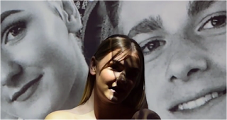 We have stuck to the conventions of the indie pop genre by having a narrative in our music video. The video follows a simple love story, with the main role of the female singing and looking back on her superficial love that she has. This becomes more clear that she is looking back on her memories with her boyfriend because of the scenes where the projector is used. Ella is looking back on the times she was happy and sharing to the audience one of her dates that she went on with him, before creating a superficial love.
 Also, the majority of our location is in the woods or in scenic places like most indie pop genres. However, you could say that we have subverted this by not creating mystery from the locations because the scenic areas are in the daylight, but we have created a sense of mystery as most of the video is from her boyfriends perspective, and the audience does not meet him fully you can only see him through the pictures we have shown through the projector.
The video conforms to the conventions for the genre's mise-en-scene, you are able to tell the type of person Ella is portraying by the way she is dressed and the amount of make up she is wearing. The clothing she is wearing is causal yet edgy, it isn't what someone would
 generally wear all the time. Her bandot is Calvin Klein this suggests to the audience that she is wealthy as she is wearing branded clothing, she is also wearing a pair of Jordans. Her make up is very simple, suggesting that she doesn't care that much about looks and prefers the natural look instead of having to go to extremes to make herself up to be someone that she isn't. In some sense make up can hide who you really are, whereas we have decided to showcase what she has naturally.
 We used many close ups throughout the video especially when she was singing the song, this is so the audience can see her expression her face to link to what is happening in the song. We also used a variety of long shots so that the audience could tell where they were on their date as they went to many different locations in London. We also did quite a lot of hand held shots because the music video is from her boyfriends perspective so when the camera moves it is like his movements.
 In the editing process we used put a few of the shots on a slow motion effect this is to emphasise to the audience of how much of a good time she is having to make them, feel more emotion towards her because the song is about heartbreak. Also, we decided to speed up the part of the video with her looking around the room reflecting on her relationship with her boyfriend, this is to show the audience how time goes fast and her going through different emotions of feeling lost and alone because of her superficial love.
 When designing our artists magazine advertisement we stuck to some of the conventions that we researched. One of the things I noticed when analysing the adverts all of the things in common was that most were very plain and too the point. People would get bored of reading too much on a poster, they would rather know the key information. This is why we only put the album title, the artists name and her twitter and Instagram name to promote her social media. Also, in the adverts that I have researched the artists did not have their full body in the picture. In some ways we have subverted this in our advert because we have used long shots instead of mid shots. This allows our target audience to see that Ella does have a different sense of styling instead of the one outfit that is used throughout the whole video. The advert as a whole can be appealing to our target audience because the audience is of late teens to the early 20s, therefore they want it to be to the point and able to relate to the artist to make them want to go out and buy it, which I think we have done through the costume decision. The styling has become more current by Ella having her hair in space buns and a chocker.
 Most of the digipaks I researched in the indie genre were colourful and pleasing to the eye. However, the artist Lorde has her digipak in black and white so we decided to follow in her footsteps. Our single from the album 'Superficial Love' is all about being in a fake relationship and wanting more. This can be shown through the digipak by making the background wall black and white and keeping Ella in colour. This allows the audience to believe that everything around Ella is miserable and dark, while she is trying to stay positive because she remains in colour. However, she is wearing grey colour so she may not be as positive as she likes to think she is.
The reason for the pink writing on the album is to show the consistency of the symbol of love, to show that it is always present. The colour is seen on the magazine advert and in the music video by using pink flowers as a scenery background.
As a result of our music video, magazine advertisement and digipak I believe we have generally stuck to the conventions of Indie Pop, while also trying to challenge and subvert them, making our 3 products a success.
 We have stuck to the conventions of the indie pop genre by having a narrative in our music video. The video follows a simple love story, with the main role of the female singing and looking back on her superficial love that she has. This becomes more clear that she is looking back on her memories with her boyfriend because of the scenes where the projector is used. Ella is looking back on the times she was happy and sharing to the audience one of her dates that she went on with him, before creating a superficial love.
  Also, the majority of our location is in the woods or in scenic places like most indie pop genres. However, you could say that we have subverted this by not creating mystery from the locations because the scenic areas are in the daylight, but we have created a sense of mystery as most of the video is from her boyfriends perspective, and the audience does not meet him fully you can only see him through the pictures we have shown through the projector.
 The video conforms to the conventions for the genre's mise-en-scene, you are able to tell the type of person Ella is portraying by the way she is dressed and the amount of make up she is wearing. The clothing she is wearing is causal yet edgy, it isn't what someone would

 We used many close ups throughout the video especially when she was singing the song, this is so the audience can see her expression her face to link to what is happening in the song. We also used a variety of long shots so that the audience could tell where they were on their date as they went to many different locations in London. We also did quite a lot of hand held shots because the music video is from her boyfriends perspective so when the camera moves it is like his movements.
  In the editing process we used put a few of the shots on a slow motion effect this is to emphasise to the audience of how much of a good time she is having to make them, feel more emotion towards her because the song is about heartbreak. Also, we decided to speed up the part of the video with her looking around the room reflecting on her relationship with her boyfriend, this is to show the audience how time goes fast and her going through different emotions of feeling lost and alone because of her superficial love.
  When designing our artists magazine advertisement we stuck to some of the conventions that we researched. One of the things I noticed when analysing the adverts all of the things in common was that most were very plain and too the point. People would get bored of reading too much on a poster, they would rather know the key information. This is why we only put the album title, the artists name and her twitter and Instagram name to promote her social media. Also, in the adverts that I have researched the artists did not have their full body in the picture. In some ways we have subverted this in our advert because we have used long shots instead of mid shots. This allows our target audience to see that Ella does have a different sense of styling instead of the one outfit that is used throughout the whole video. The advert as a whole can be appealing to our target audience because the audience is of late teens to the early 20s, therefore they want it to be to the point and able to relate to the artist to make them want to go out and buy it, which I think we have done through the costume decision. The styling has become more current by Ella having her hair in space buns and a chocker.
 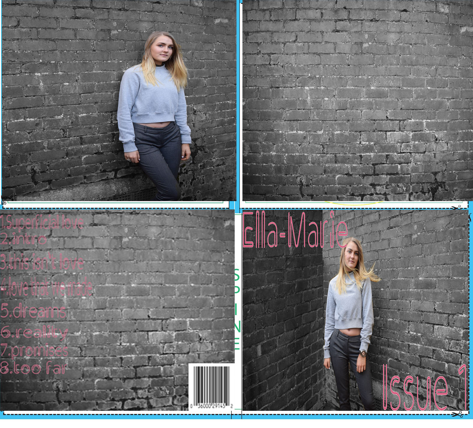 Most of the digipaks I researched in the indie genre were colourful and pleasing to the eye. However, the artist Lorde has her digipak in black and white so we decided to follow in her footsteps. Our single from the album 'Superficial Love' is all about being in a fake relationship and wanting more. This can be shown through the digipak by making the background wall black and white and keeping Ella in colour. This allows the audience to believe that everything around Ella is miserable and dark, while she is trying to stay positive because she remains in colour. However, she is wearing grey colour so she may not be as positive as she likes to think she is.
 The reason for the pink writing on the album is to show the consistency of the symbol of love, to show that it is always present. The colour is seen on the magazine advert and in the music video by using pink flowers as a scenery background.
As a result of our music video, magazine advertisement and digipak I believe we have generally stuck to the conventions of Indie Pop, while also trying to challenge and subvert them, making our 3 products a success.
Wednesday, 1 February 2017
Final Digipak


Subscribe to:
Comments (Atom)